Building a Modern Component Library for WattBuy
As the sole designer handling everything from strategy to execution, I needed to create systems that would let me work faster and more consistently. While leading our transition to Chakra UI, I tackled the inconsistencies that were slowing me down and creating extra work for developers.
Color
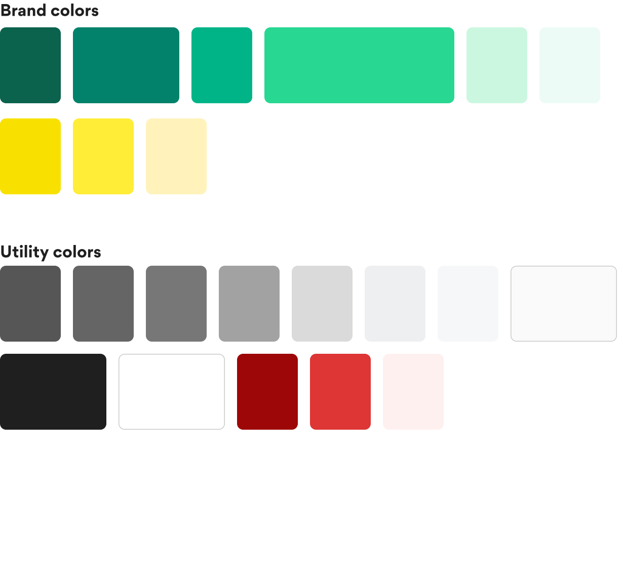
Extending the color system
Problem
As the only designer, I was constantly reinventing the wheel:
- I had to make color decisions on the fly for every new feature, which was inconsistent and time-consuming
- The overused bright teal was making everything look harsh, but I didn't have good alternatives
- When we brought in freelance designers, they had no clear guidelines to follow
Solution
I needed something systematic that would speed up my work and make handoffs cleaner:
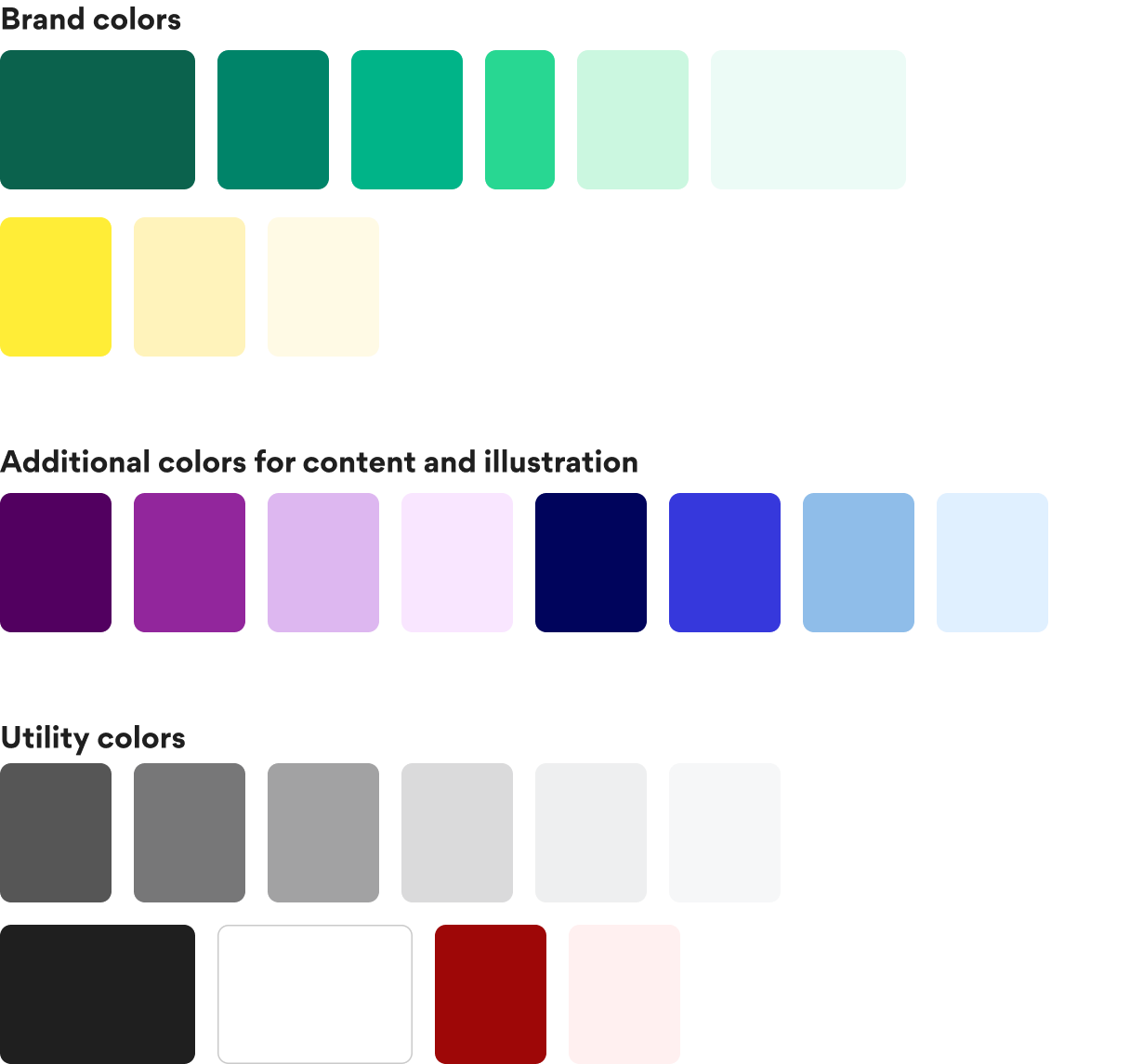
- Added two new base colors with lighter variations so I'd have proper options for any design situation
- Cleaned up redundant colors that weren't serving a purpose
- Created clear usage rules so any freelancers could jump in and stay consistent
How we applied it
We kept the main brand color for important buttons and key actions, but now designers had better options for everything else.
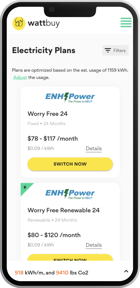

Banners
Designed for special offer call outs.

Superlatives
Making it easier to pick the best option.

CTAs
For the most important element, we maintained the main brand color.
Illustration
Making technical content more appealing
Problem
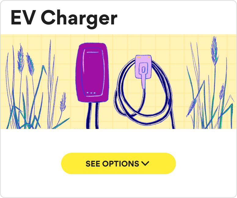
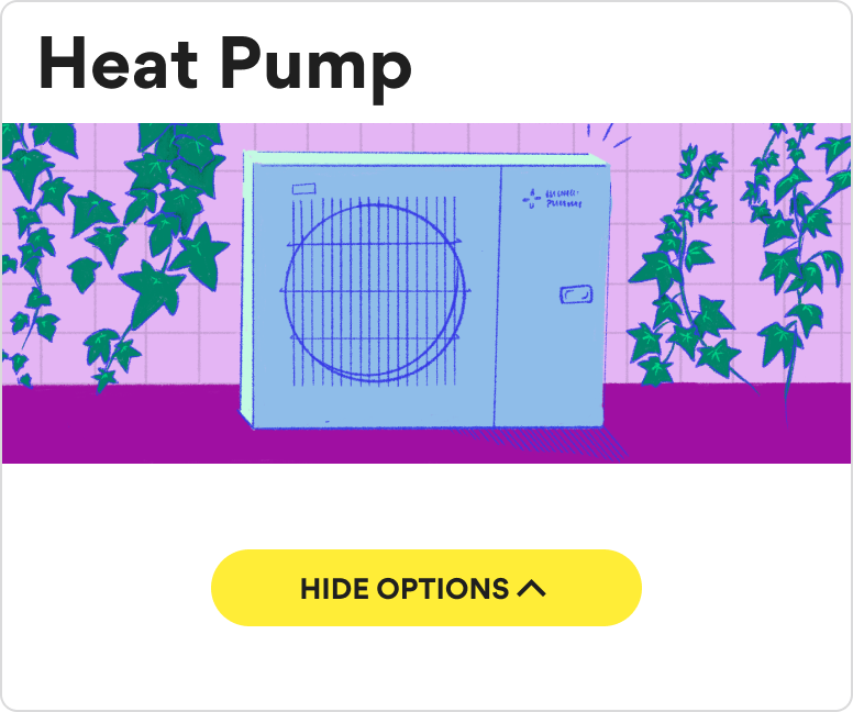
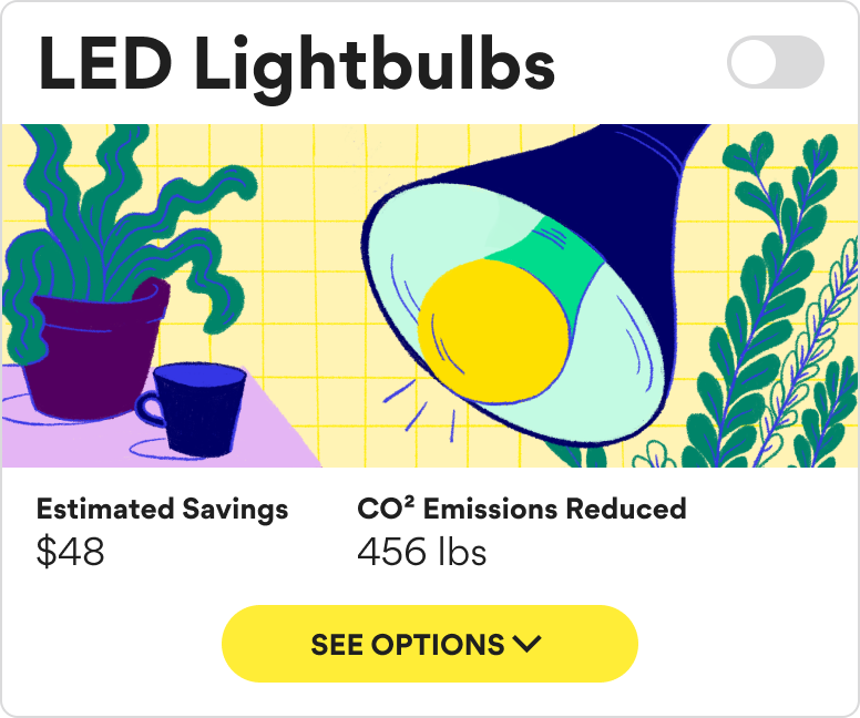
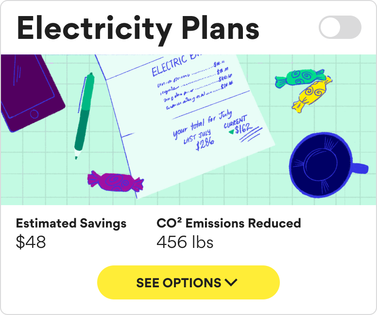
Our main product is an energy marketplace, and we needed illustrations that could work for both concrete things (like heat pumps) and abstract concepts (like energy programs). Everything felt pretty dry and technical.Solution
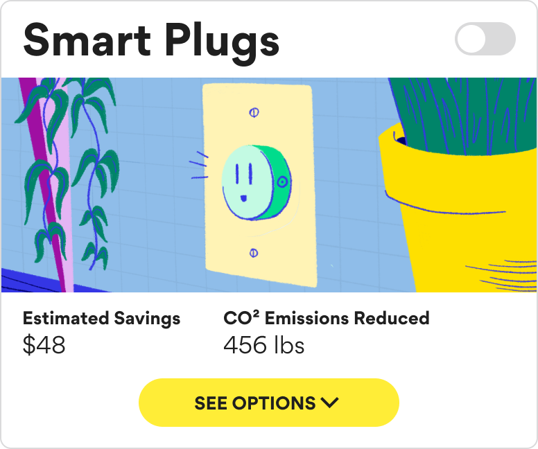
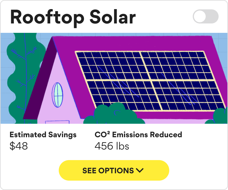
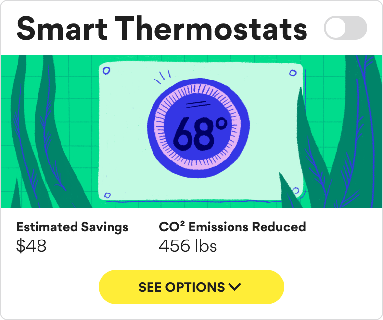
I created a unified illustration style that brought some warmth to the brand while staying professional. Each category needed a custom illustration, but since we don't add new categories often, the extra design time was worth it for a much more cohesive experience.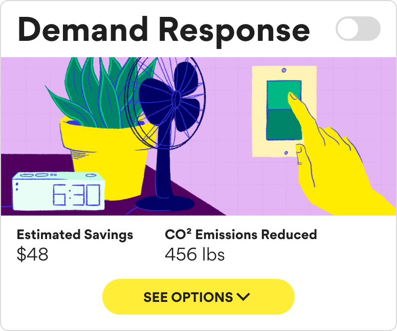

Spot illustrations
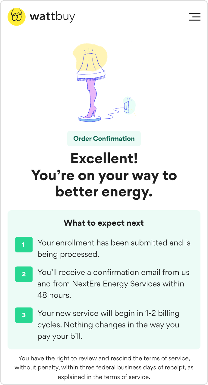
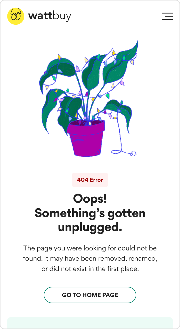
I designed spot illustrations used throughout the product—in forms, confirmations, empty states, and error screens. These illustrations visually expressed the company's "playful" brand trait and helped break up dense, technical content.
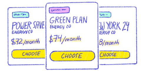
Electricity plans

Energy customers

House with solar
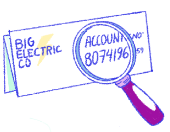
Electricity bill

Signing paperwork
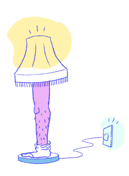
Energy success
Reduce, reuse, recycle
To keep myself efficient, I built illustrations from reusable elements. This meant I could create variety without starting from scratch every time - crucial when you're the only designer handling multiple projects.
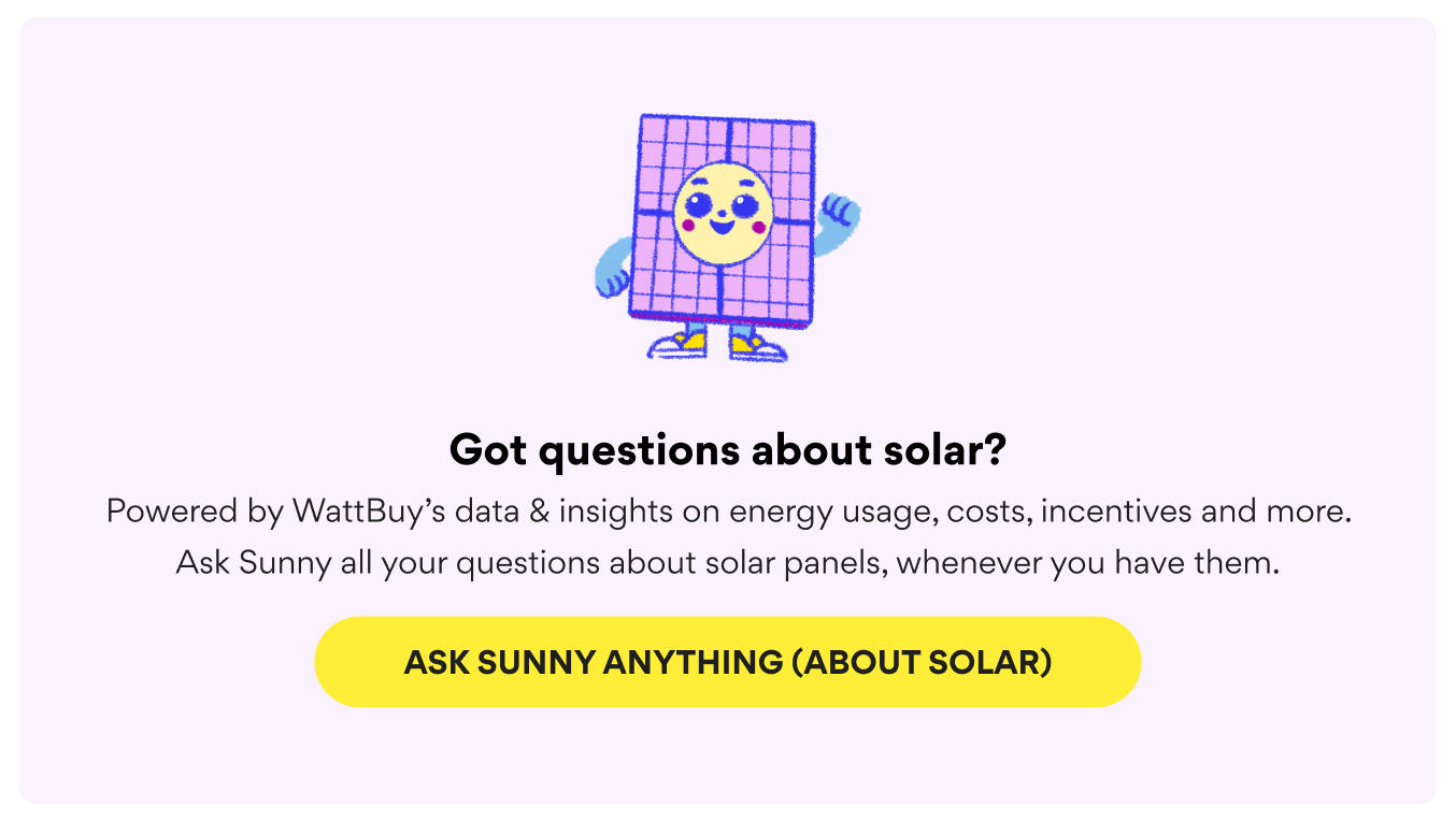
Sunny mascot
I also illustrated the mascot for our AI solar advisor, Sunny – a friendly solar panel character designed to visually match the product's approachable tone.
Brand voice
I was handling both design and copy, but I realized I needed guidelines for when we brought in freelance writers or when other team members had to write something. Energy is confusing and people are usually frustrated when they're dealing with it - either complaining about bills or feeling like they've been scammed.
I developed four key voice principles that anyone writing for the product could follow:
Knowledgeable
Always informed, cutting through the noise to share what actually matters and protect against misinfo.
"You might see ads promising 'free solar panels,' but there's really no such thing. While incentives or zero-down loans can help with upfront costs, you'll still pay for your system over time—there's no magic shortcut."
"Have you seen ads offering free solar panels? Well, it's kind of true. There are ways to make this happen through leasing."
On point
Practical suggestions backed by clear reasoning—no fluff, just what makes sense for your situation.
"Your current plan charges 13¢ per kWh. We recommend switching to the Energy Hop 24 plan from LocalEnergy, which is just 9¢ per kWh. That could bring your monthly bill down to about $78 during lower usage months and $145 during higher usage months."
[When user is searching for energy plans] "Going solar is a great way to feel good about your energy use and help the planet, so maybe consider panels for your roof someday!"
Approachable
Conversational and judgment-free, meeting people where they are without talking down to them.
"Your energy bill is split into two main parts: what you pay for the electricity itself (that's supply), and what you pay to get it delivered to your home (that's delivery)."
"Your bill is calculated based on your kilowatt-hour consumption multiplied by the variable transmission and distribution rate as set by your local ISO. Ancillary charges may fluctuate according to ERCOT protocols and the time-of-use tier."
Playful
A pleasant sense of humor, sweet and a bit silly, like dad jokes, to lighten a boring and unpleasant topic.
"kilo-WHAT-hours?! We break down what you need to know to switch to cheaper energy."
[In response to an irate customer email] "Whoa, don't blow a fuse! Maybe try turning your computer off and on again."
This attribute should be used selectively to add levity to overwhelming topics. Do not use it in cases in situations where humor would be inappropriate, such as communication with upset customers or where empathetic, straightforward answers are needed.
UI components in action
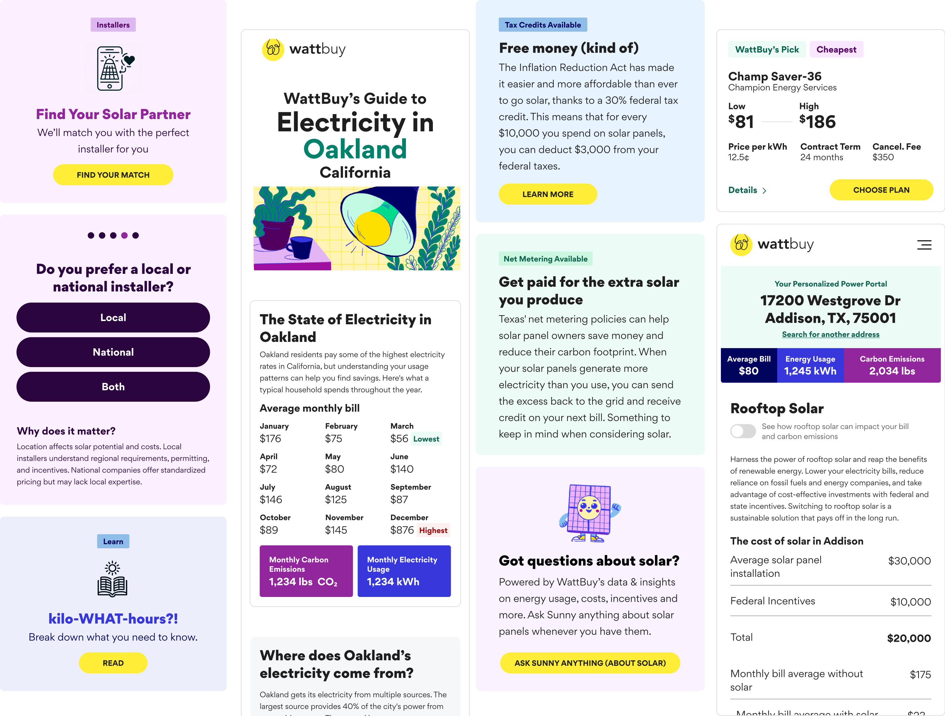
The expanded color system and reusable components made it easier to create consistent interfaces across different product areas - from solar guides to energy marketplace listings.
Impact
previously spent on visual QA cycles and developer rework
empowered to create on-brand content without requiring constant oversight

