Yana Barysheva
About me
Lead Principal Staff Director of Product Design Work

Untangling Deregulated Energy: Strategic UX for a Complex Multi-State Market

Impact

Redesigned the underperforming core product to improve efficiency, enhance user experience, and reduce operational overhead across multiple state markets.

WattBuy mobile mockup

Context

The company

WattBuy, Series A clean energy startup helping consumers switch to cleaner energy through data-driven recommendations.

My role

Founding designer
(Director of Design on paper)

Product

(B2)B2C energy platform – consumer marketplace for electricity and solar, plus APIs for enterprise partners.

This project

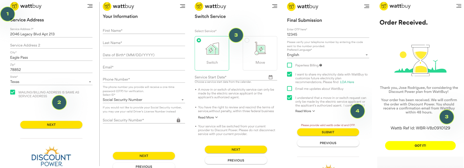
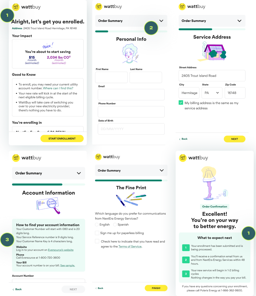
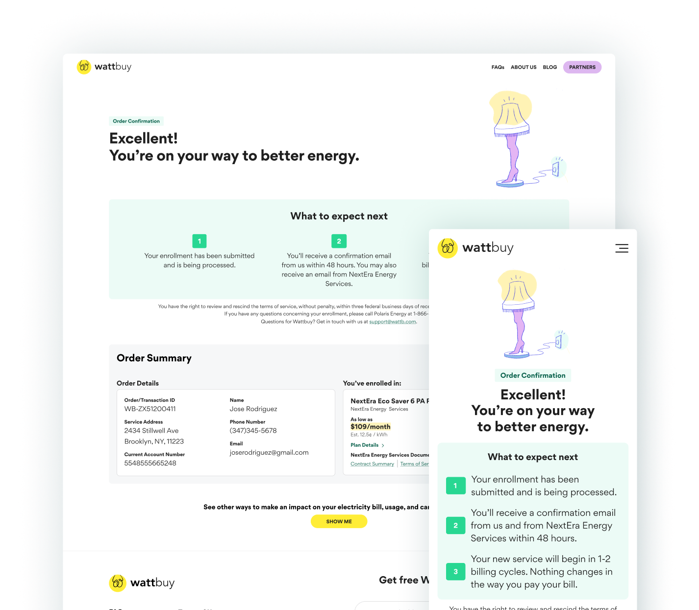
Redesigning an intricate enrollment flow

What I did

Usability testing and analysis, UX improvements, UI design, illustration, copywriting

Other players

Collaborated with CPO for rollout prioritization; engineering for implementation and understanding API requirements.

Timeline

~4 months

The problem

Our only revenue-generating product was bleeding money

  • ~2,000 customers abandoned enrollment annually, representing over $200K in lost lifetime value
  • Flow designed by offshore engineers with zero UX consideration
  • Sole customer service rep overwhelmed with repetitive emails
  • Trust and accessibility issues: inconsistent fonts, poor visual hierarchy and contrast, no transparency

"I am trying to sign up for new service. We are moving into our new home next Monday.

I am elderly and cannot figure out how to do this as it keeps asking me for a current account number.

Also important is how much this will cost me, my electric bill has gone up significantly in the past few months so the last thing I need is to pay more."

— Email sent to customer support

Challenges

Critical complexity

tangled arrows

Flow challenges

Providers required varied field sequences – needed one flexible design accommodating all APIs.

Texas

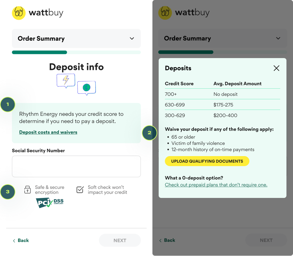
Regulatory variation

Unique enrollment requirements across deregulated states, with Texas requiring credit checks and deposits.

piggy bank

Business risk

Redesigning our sole revenue source without breaking what was working – missteps could be catastrophic.

Before

Design & flow

Existing flow had an unprofessional appearance and confusing UX that reinforced negative industry stereotypes of scamminess.

1 Missing/jumping progress bar

2 Bad typography

3 Lack of information

4 Accessibility violations

Mobile example

Key improvements

Design & flow

1Proactive support

"Checkout" page & order confirmation page answers FAQs up-front.

2Reduced Cognitive Load

Indeterminate progress bars eliminate user frustration when conditional logic adds unexpected steps.

3Contextual Information

Key details surfaced exactly where relevant to reduce drop-offs and CS inquiries.

+

Brand credibility

Updated branding (UI, illustration) combats scammy industry perceptions and establishes trustworthy brand presence.

Accessibility standards

WCAG-compliant palette strengthens credibility and better addresses an older-skewing audience

Enrollment flow after redesign

Key improvements

Addressing deposit drama

The enrollment flow in Texas, where deposits are sometimes required, showed the amount only after submission.

Customers enrolled just to find out the number, then flooded support with emails asking to cancel. Alternative no-deposit options were buried.

Considering limited engineering resources at the time, I added basic informational content as a simple, in-scope MVP solution.

1 Explain need for sensitive info

2 Answer users' main questions

3 Assuage two ubiquitous fears

Texas enrollment deposit info

Rollout risk management

Launched initially in Pennsylvania as a pilot market to validate the redesign with minimal risk.

Following positive user feedback and reduced support tickets, we continued to expand to the remaining non-Texas states over the course of several weeks.


Screens from measured rollout
Appendix Mobile screens
mobile mockups
Appendix Desktop screens
desktop mockups