
Challenge
When commercial real estate agents go on tours to show clients potential office spaces, they usually see multiple spaces in one day. The spaces may be located in different neighborhoods and the agent has to coordinate with both the client and the landlord to be in the right place at the right time. There is a lot of listing-specific information they need to remember for multiple clients, all of whom want to see multiple listings, and be treated like VIPs while they're doing it. Making these problems more difficult to solve is the fact that (commercial) real estate is a notoriously tech-phobic industry.
Solution
We prototyped an app that would help agents get through their tours without tripping over anything. Their tour schedule was listed in the app with times, locations, and travel directions. We added features that allowed them to quickly coordinate with all relevant parties, such as the "I'm running late" button. The listings had all the info readily accessible and editable to allow the agent or the client to add additonal photos or notes. Most importantly, given how important the appearance of the agent's undivided attention was, we made these features easy to use with your eyes closed.
Concept Exploration
Spaceful was a tool built by Originate that helped commercial real estate brokers put together tour books for the clients listing all the spaces they would see on a tour. The next thing we wanted to create was an app to be used during a tour of an office space, but what did a tour actually look like? We sketched out an assumptive user journey based on previous knowledge and our imaginations. We ended up with a bunch of questions: how do brokers get between tour stops? Do they have the keys to the places or do they meet someone? What if that person doesn’t show up? How long does a tour take? Do they celebrate afterwards?
As we reviewed some of the potential challenges on a tour, we came up with “How Might We” questions, such as “how might we ensure nobody forgets about the meeting time?” and “how might we highlight the client’s priorities?” Between our “How Might We”’s and feature requests we had heard over the years, we had enough ideas to come up with six testable concepts:
The real estate industry is still pretty manual, and we wanted to automate. Our next steps were to take our concepts – which we assumed would be useful and valuable to brokers – and to test them.
Research
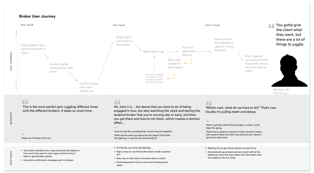
We interviewed eight commercial real estate brokers and asked them to describe their last space tour before showing them the concepts. Inevitably, some of our assumptions were proven and some disproven. For example, brokers and clients did not celebrate with drinks at the end of the tour as we had fantasized, but instead, made do with a harried debrief on the sidewalk outside their last stop.
Their comments about the concepts were also eye-opening. In response to the rankable list of client needs, one broker told us he often encourages clients to explore the digital tour book on his phone but that people were hesitant to touch such an intimate piece of technology. What stood out to me in particular was how concerned they all were about looking knowledgeable and professional. The brokers were excited to have the assistance of an app, but concerned that it would look like they were playing with their phones during the tour. The high-stress nature of their jobs made me feel sympathetic for our users, but more importantly, it affirmed the importance of creating an easy-to-use-with-eyes-closed UX.
Next, we synthesized and organized our research into themes, which informed our user personas’ goals, needs and motivations. For the user journey, we drew from the tour descriptions our users had given us and added a vertical axis indicating how happy or frustrated the user was at any given point. Now we had user stories outlining what needed to be done and user personas and journeys to shape the product. It was enough to start building a testable prototype.
A New Process: OOUX
Around the time this project began, Evan and I started discussing Sophia Voychehovski’s unique design process called Object-Oriented UX, which helps bridge the gap between user stories and a functional design. In short, with OOUX, you build a product from the inside out, starting with modular components which you puzzle together into pages. This approach leads to a holistic, user-focused and complete collection of all the objects and calls-to-action in your product. It’s also very fast; it look me and Evan only four days to go from disparate research to functioning (paper) prototype. It would have taken two weeks otherwise.
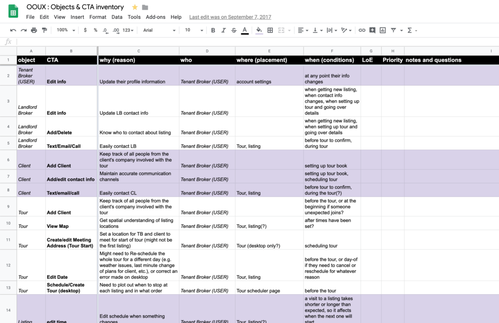
We quickly uncovered a number of problems and questions. The difference between similar CTAs were unclear. We weren’t sure how we would integrate Google Maps. What stumped us both was: what did the app open to? What was on the homepage?
I kept thinking about my recent trip to Oakland. It had been one of the worst flights I’d ever experienced, and as I stumbled out of the airport, I dreaded having to hunt for the address of my Airbnb. But when I opened the app, it greeted me immediately with the exact information I needed. This seemed like the perfect solution for our harried, nervous users. We decided that we would show them what they needed to see at any given time, depending on whether they had a tour coming up soon, were on their way, at a listing, traveling between listings or wrapping up afterwards. We were careful to strike a balance between highlighting the most relevant information and not confusing the user with too much inconsistency.
Prototype
After our exploration, I digitized the screens in Sketch and hooked them up in Atomic. Since we were building an MPV for limited testing purposes, we chose to keep the design extremely minimal – basically just high-fidelity wireframes. Check out the InVision prototype or this video walkthrough:
Final Thoughts
The process for this project was ad-hoc, almost haphazard. Much of it was carried through on intuition borne of experience and of sincere empathy for the user. I’ve realized our lack of attachment to any established process or solution was what made it so good. Our decision to show brokers content based on context left nothing to put in a menu, so we scrapped the traditional nav structure altogether. The OOUX process enabled our flexibility by making every element of this product modular and movable. At every decision point, we simply made the best decision possible based on our learnings thus far and that was that. And yet it turned out to be one of the smoothest projects we’d ever been on.